Modern Political & Social Campaigns
In an era where viral hashtags can spark global conversations and campaign logos become instant cultural touchstones, graphic design has never been more integral to modern politics. From sleek social media ads to citywide billboard blitzes, the visual language of campaigns frames our collective hopes, fears, and identities in ways words alone can’t match. Whether it’s a meticulously designed presidential poster or a grassroots rally sign, every color choice and typeface decision shapes how we perceive a candidate or cause. Far from just eye candy, these designs distill complex ideas into instantly digestible imagery—moving us to vote, march, donate, or simply pay attention.
Graphic design
in campaigns
How graphic design is used in propaganda, politics
and social agitation
Graphic design is more than just eye-catching visuals; it’s a strategic force that has swayed nations, fuelled social movements, and shaped the course of history. From the bold posters of World War II urging citizens to “Keep Calm and Carry On” to the viral campaign graphics that helped elect presidents, design has long served as a powerful catalyst for collective action.
By tapping into colour psychology, striking typography, and symbolic imagery, political and social campaigns capture public attention and guide behaviour — often in ways we only fully appreciate years later.
Allied WWII Posters: (1939-1945)
During World War II, the Allied nations used posters as a powerful way to inspire unity, boost morale, and encourage specific behaviours on the home front. These bold visuals weren’t just decorative—they were vital in rallying the public to support the war effort. Spreading messages about rationing, buying war bonds, and keeping sensitive information under wraps, Allied posters showed how graphic design could rally an entire population toward a single cause. Even decades later, many of these designs remain iconic, reminding us that simple images and slogans can unite people in times of crisis.
Key Points About Allied WWII Posters:
Posters often featured upbeat or patriotic imagery to keep people’s spirits high, even in the midst of air raids and shortages.
Morale and Unity
Targeted images and slogans persuaded men to enlist in the military and encouraged women to step into factory and farm jobs traditionally held by men.
Recruitment and Workforce Participation
Striking visuals tapped into feelings of duty, pride, and even fear to urge immediate action.
Emotional Hooks
Many of these posters became cultural landmarks, recognized far beyond the war itself, illustrating the lasting power of strong design and messaging.
Universal Recognition
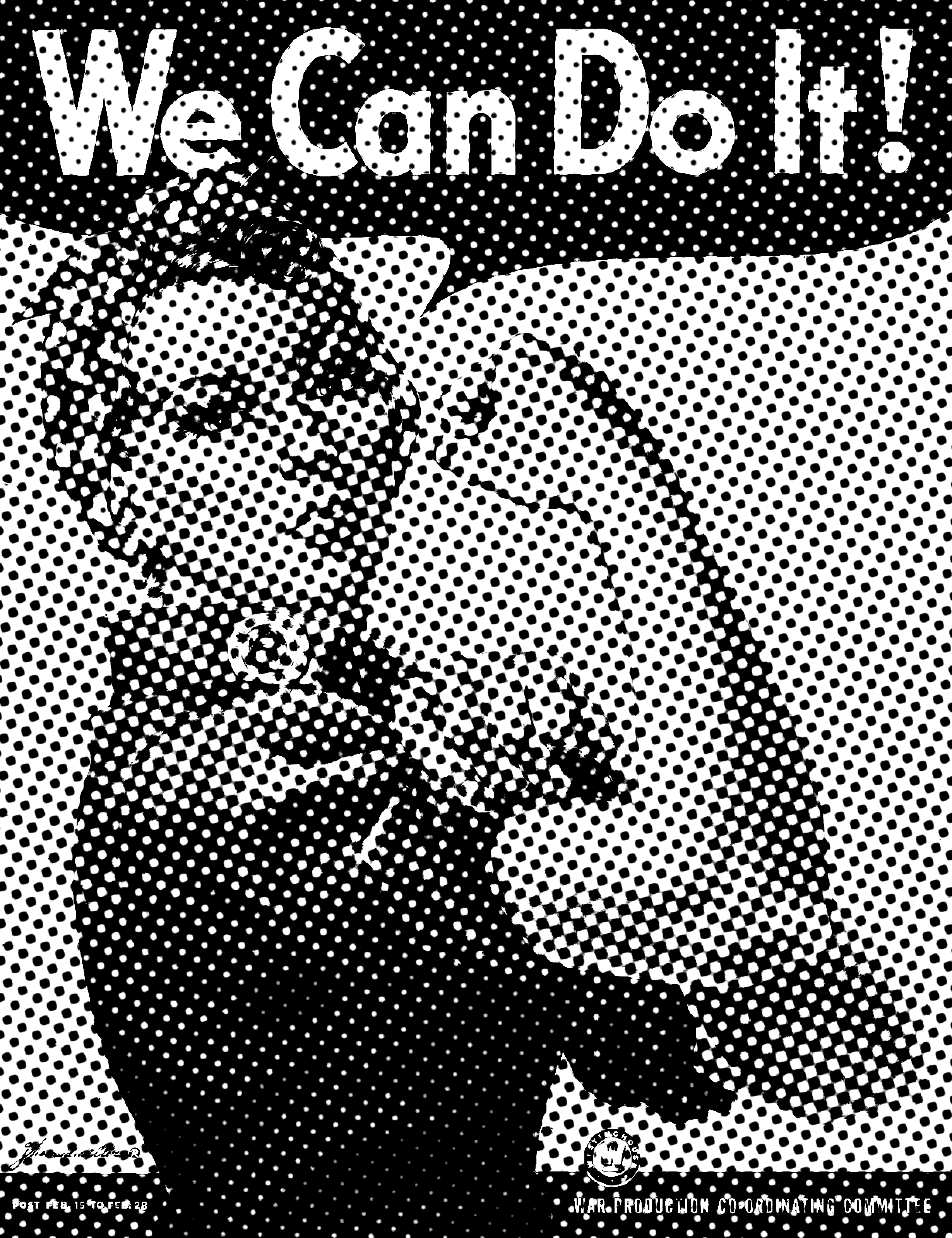
“We Can Do It!”
(United States, 1943)
Created by J. Howard Miller, this poster features a confident female factory worker—later nicknamed “Rosie the Riveter.” Although initially aimed at boosting morale among Westinghouse factory workers, it evolved into a broader symbol of women’s empowerment1.
Bold Color Contrast: A bright yellow background set against navy-blue clothing and a red polka-dot bandana immediately grabs attention.
Central Figure: The stylized illustration of a confident female worker dominates the composition, making her the sole focal point.
Strong Typography: The sans-serif “We Can Do It!” text is large and easily legible, encouraging quick recognition and motivation.
Empowerment and Mobilization: By depicting a strong, capable woman, the poster helped normalize the idea that women could perform industrial jobs just as effectively as men.
Morale Boost: The upbeat color palette and positive slogan instilled a sense of optimism and contributed to higher workplace productivity among female factory workers.
Long-Term Identity Shift: Although originally a morale booster for a single factory, its later re-emergence turned the image into an enduring feminist icon, influencing conversations around gender roles for decades.
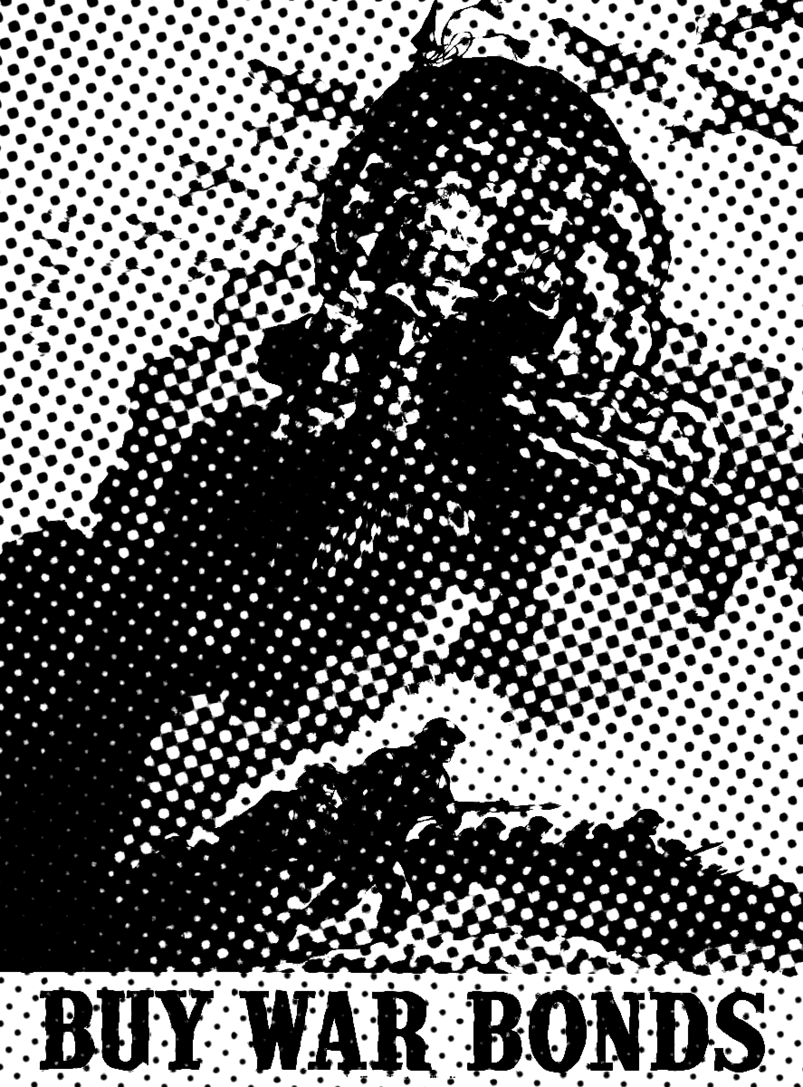
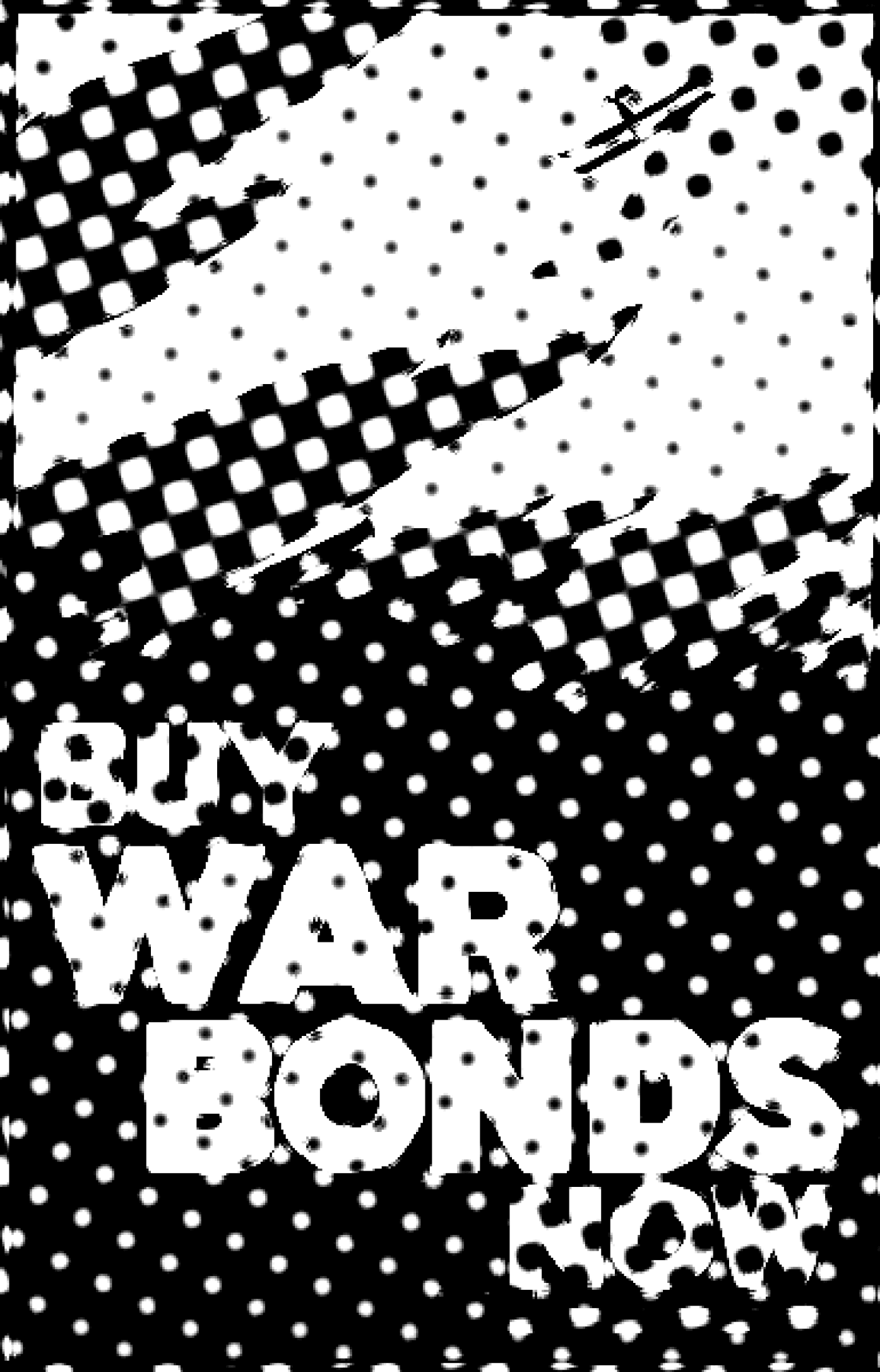
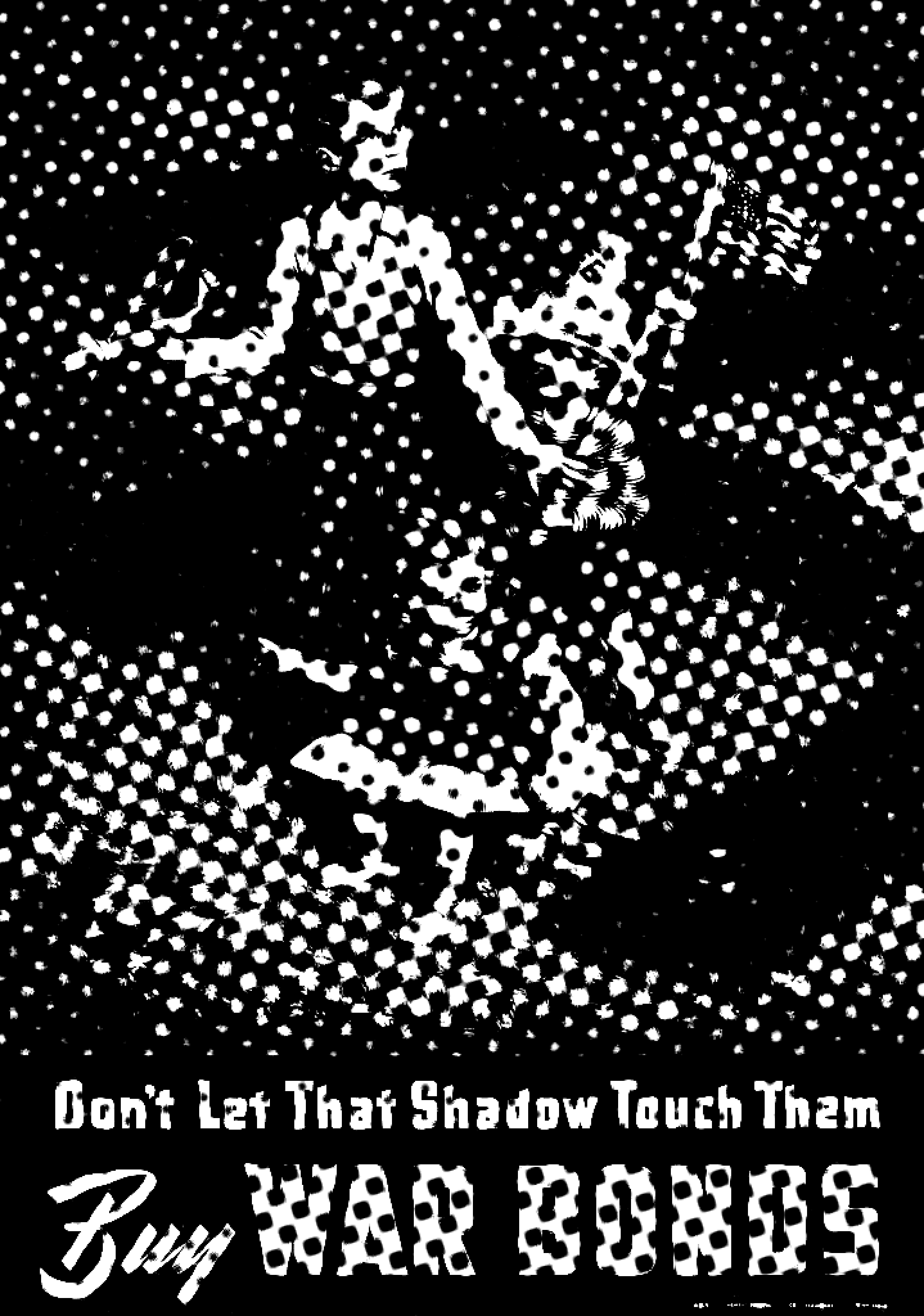
Across both countries, posters urging citizens to purchase war bonds used patriotic imagery (flags, soldiers, Uncle Sam) to link financial contributions directly to the war effort. Buying bonds became an act of national loyalty, helping fund weapons, supplies, and troop movements.
"Buy War Bonds"
(U.S. & U.K., 1942)
Patriotic Imagery: Flags, soldiers, or Uncle Sam often appear, leveraging national symbols to evoke loyalty and duty.
Emotive Slogans: Short, commanding phrases like “Buy War Bonds!” keep the message straightforward and compelling.
Vibrant Color Schemes: Reds, blues, and whites dominate, instantly associating the design with patriotism and national unity.
Financial Participation: By linking monetary support to the idea of helping “the boys overseas,” these posters made purchasing bonds feel like a personal contribution to victory.
Peer Influence: Owning war bonds became a point of pride, encouraging friends and neighbours to do the same — driving a communal sense of duty.
Economic Backbone: The widespread bond - buying spurred critical funding for weapons, supplies, and other wartime necessities, directly supporting the Allied effort.
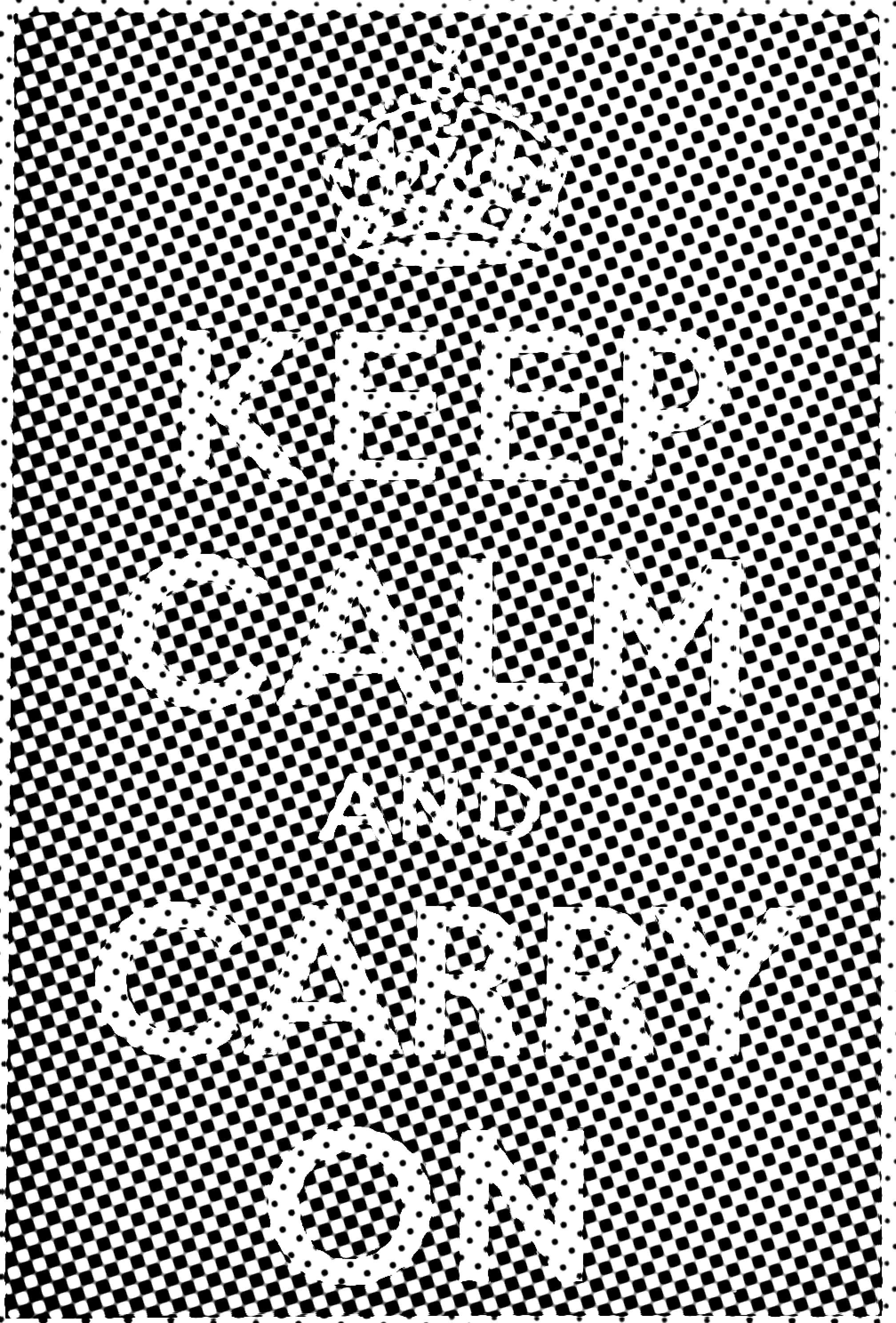
“Keep Calm and Carry On”
(United Kingdom, 1939)
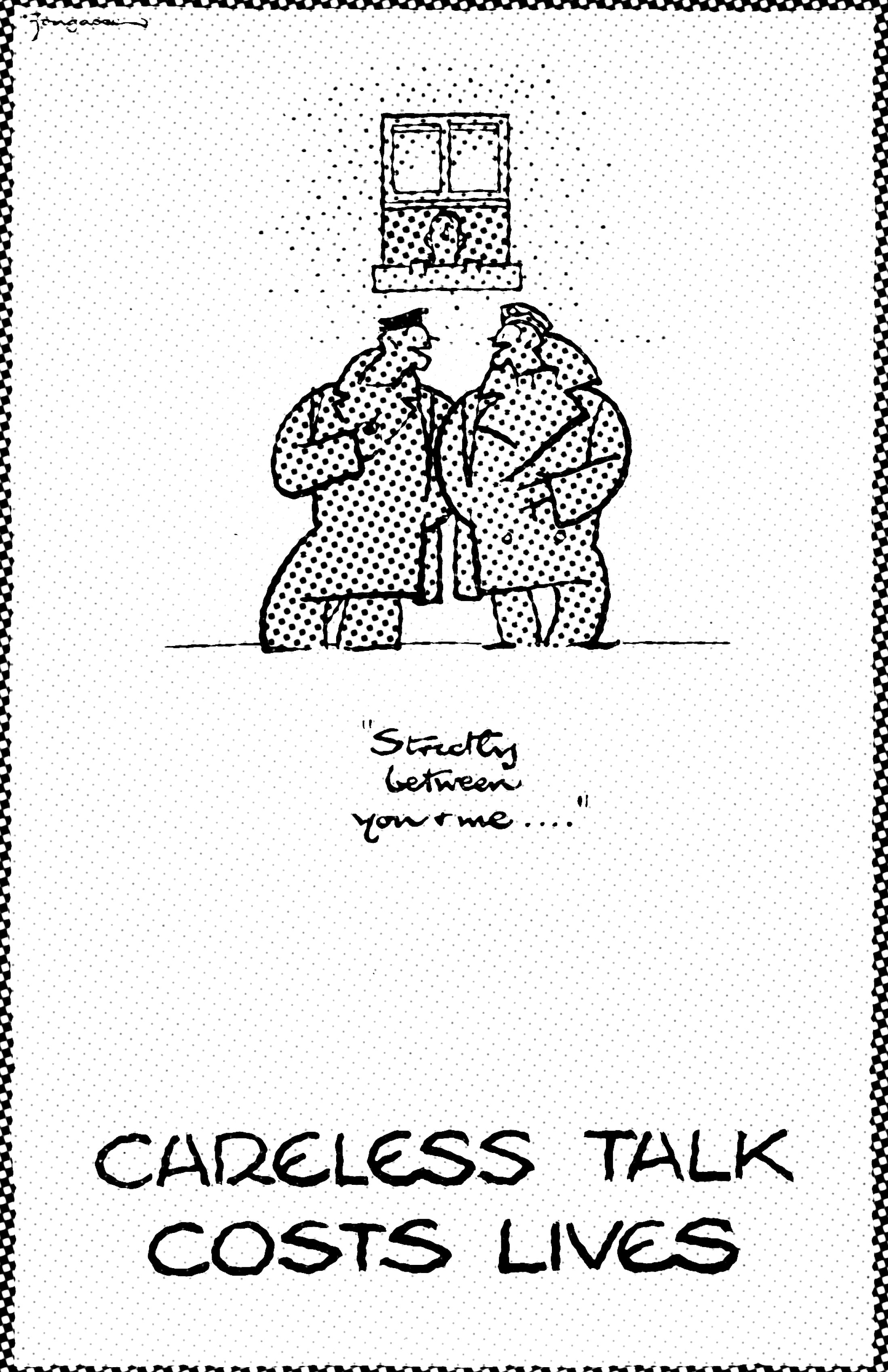
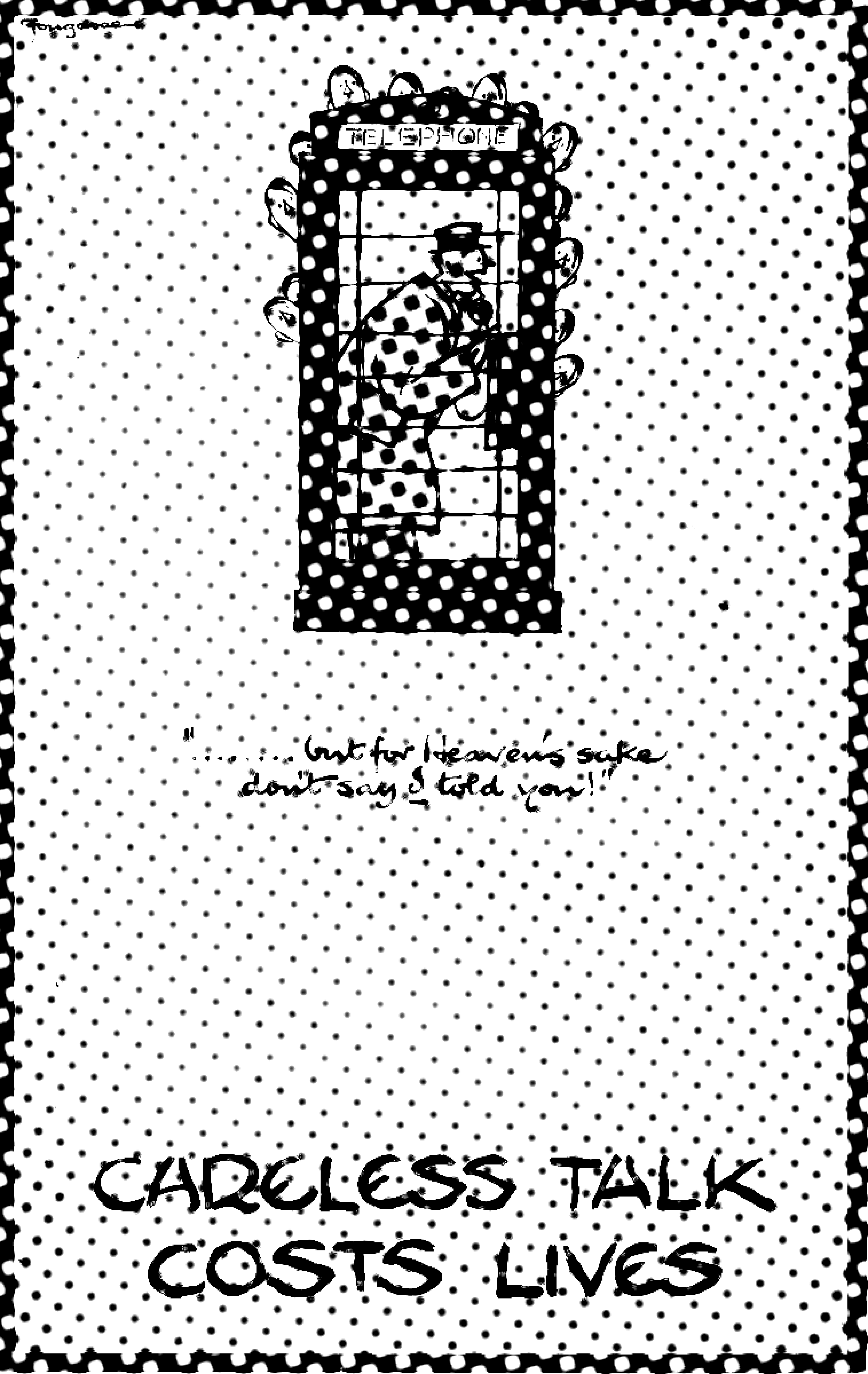
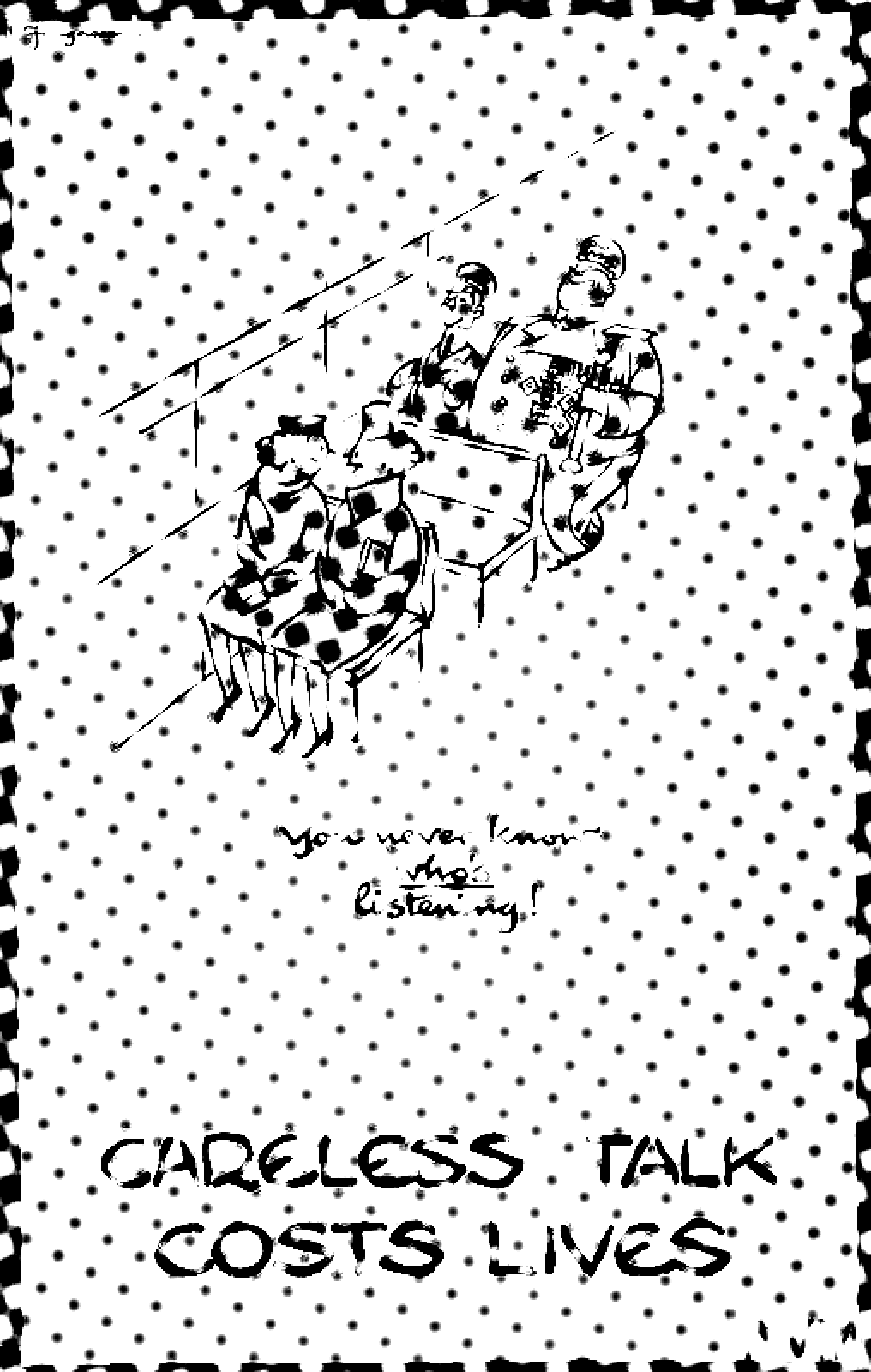
“Careless Talk Costs Lives” (United Kingdom, 1940s)
Commissioned by the British Ministry of Information, this famously understated poster was designed to brace the public for a possible German invasion. Though rarely used during WWII, the slogan found a second life in the 21st century, popping up on everything from mugs to memes.
Cartoons by artist Fougasse depicted Hitler or Nazi officers lurking behind everyday scenes, driving home the idea that loose talk could give the enemy an edge. The playful style kept the message approachable, while still driving home the serious need for vigilance.
Simplicity: A single-color background, a crown icon at the top, and the calm, direct text “Keep Calm and Carry On.”
Centred Layout: The symmetrical arrangement creates a sense of stability and composure.
Minimal Typographic Style: Clean, legible type in white against a solid background underscores the directness of the message.
Steadfast Mindset: Though rarely used during WWII, the poster’s intended purpose was to maintain public morale and reduce panic in the face of potential invasion.
Symbolic Stoicism: Post-war, the phrase gained cultural resonance as an embodiment of British perseverance, eventually becoming a meme-like fixture in modern pop culture.
Unity Through Reassurance: Even decades later, the design’s calm tone encourages a collective sense of “we’ve got this,” reinforcing social resilience.
Key design features
Key design features
Effect on social behaviour
Effect on social behaviour
Key design features
Effect on social behaviour
Cartoonish Illustration: Drawn by Fougasse (Cyril Kenneth Bird), Hitler or Nazi officers lurk behind phone booths, tables, and everyday scenarios in a humorous but striking style.
Bright, Blocky Colours: Simple color fields help the characters stand out, ensuring quick comprehension of the scene.
Conversational Tagline: The phrase “Careless Talk Costs Lives” is both a warning and a direct instruction, making it easy to remember.
Approachable Education: The cartoon aesthetic softened the serious message, making it more likely that people would absorb and act on the warning.
Collective Vigilance: Citizens were reminded in
a lighthearted yet firm way that their words could have dire consequences, discouraging casual gossip about troop movements or plans.
Nationwide Cooperation: By portraying an almost spy-like threat in everyday life, the posters fostered a united front in keeping crucial information private.
Key design features
Effect on social behaviour
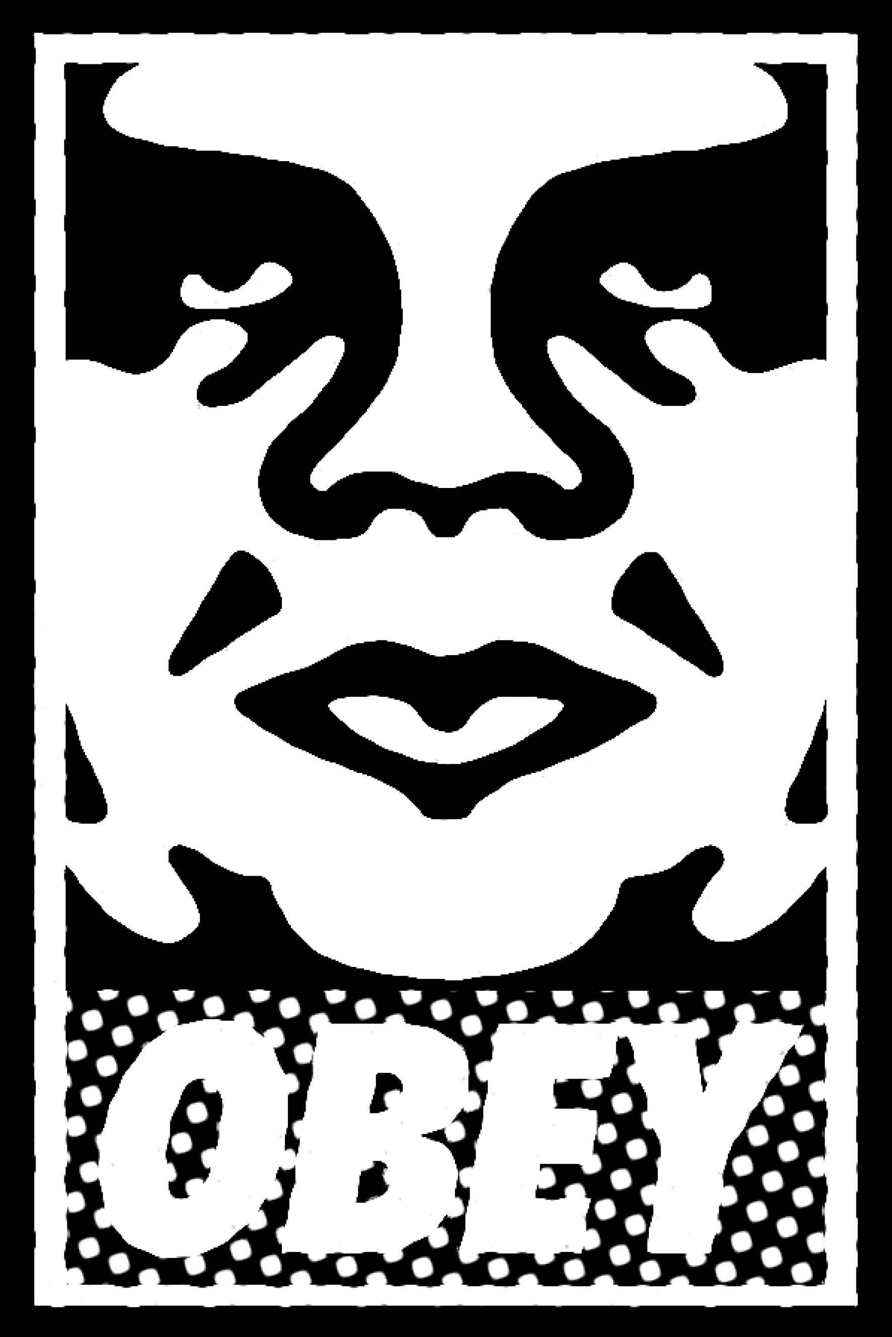
“OBEY”
(United States, 1989)
Shepard Fairey’s OBEY campaign, launched in 1989, remains one of the most recognisable and influential forces in contemporary street art. What began as a simple sticker soon evolved into a daring critique of authority and social conformity. By fusing graffiti, pop art, and political commentary, Fairey has created a visual movement that transcends the confines of art—pushing audiences to question the structures of power they’ve grown accustomed to.
Minimal Color Palette: Stripped-down black-and-white visuals created an immediate, high-contrast impact.
Bold Typography: The stark, blocky “OBEY” text echoed propaganda posters, grabbing attention with minimal words.
Iconic Portrait: By featuring Andre the Giant’s face, Fairey played with pop-culture imagery, making it both familiar and unsettling.
Repetitive Placement: Plastering stickers and posters in public spaces sparked intrigue—people couldn’t ignore the constant reminder to “OBEY.”.
Public Curiosity: Viewers were compelled to ask, “What is this?”—challenging them to question the media messages they encountered daily.
Shift Toward Street-Art Acceptance: OBEY helped bridge the gap between subversive street art and mainstream culture, elevating graffiti into a recognised form of commentary.
Cultivated Anti-Establishment Mindset: The simple yet provocative design nudged people to rethink authority, conformity, and consumerism.
Inspired DIY Movements: DIY culture adopted Fairey’s approach, using repetition and bold graphics to spark conversation and push back against the status quo.
Key design features
Effect on social behaviour
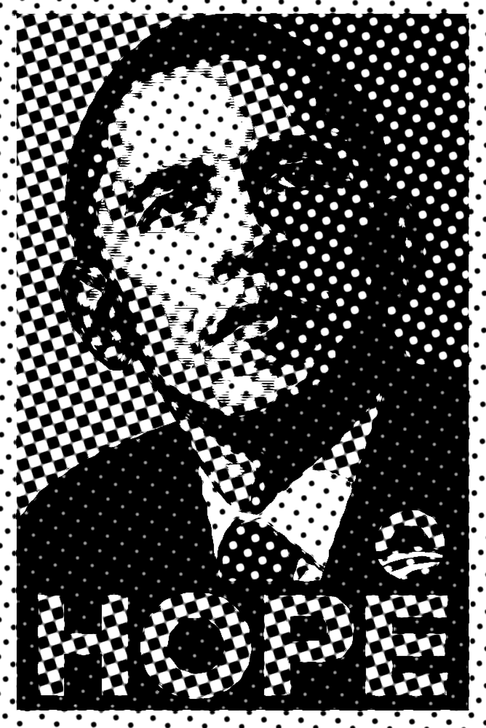
That same fearless design ethos carried over when Fairey created the now-famous “HOPE” poster for Barack Obama’s 2008 presidential campaign. While “OBEY” was deliberately apolitical—more about shaking up viewers’ assumptions than endorsing a particular stance—“HOPE” represented a direct political statement, capturing the optimism many felt at the prospect of new leadership. In style, the two works share Fairey’s signature color blocking and bold outlines, but the content of the message shifted from pure subversion to a rallying cry for political engagement. The poster’s success cemented Fairey’s reputation worldwide, demonstrating how a street-art approach could resonate with mainstream audiences and become a defining image of a modern political movement.
"HOPE"
(United States, 2008)
Tri-Color Palette: Shepard Fairey used red, beige, and light-blue to create a striking, almost pop-art style that stood out against typical campaign posters.
Simplified Portrait: Obama’s face was rendered in bold, high-contrast shapes, giving the image an iconic, easily recognisable silhouette.
Single-Word Message: Replacing lengthy slogans with “HOPE” (and occasionally “CHANGE” or “PROGRESS”) gave the poster universal appeal and an immediate emotional hook.
Street-Art Aesthetic: Similar to Fairey’s OBEY work, the poster featured strong outlines, layering techniques, and a slightly gritty texture—instantly grabbing attention both online and in the real world.
Viral Spread: The design quickly turned into
a meme and street-art phenomenon, inspiring people to create and share countless digital and physical variations.
Youthful Engagement: Its fresh, edgy style contrasted with traditional campaign materials, attracting a younger demographic that felt energised to participate in politics.
Collective Identity: “HOPE” embodied a broader sense of optimism, rallying supporters around
a shared belief in change rather than just
a policy platform.
Pop-Culture Phenomenon: The poster helped rebrand political marketing itself, blurring the line between art and campaign propaganda — and demonstrating how a single, striking image can shape an election’s cultural narrative.
Key design features
Effect on social behaviour
Key Points About Modern Campaigns:
Platforms like Twitter, Facebook, and TikTok enable campaigns to reach voters instantly, amplifying both official announcements and grassroots momentum.
Social Media Dominance
Consistent logos, colour palettes, and slogans help voters recognise and connect with a candidate’s message, fostering a sense of unity and trust.
Strong Brand Identity
Supporters can remix and share campaign designs, memes, or hashtags, rapidly expanding the candidate’s reach beyond traditional media channels.
Viral Spread
Encouraging user-generated content (like selfies with campaign slogans) helps reinforce a collective identity, turning supporters into active campaign ambassadors.
Community Engagement
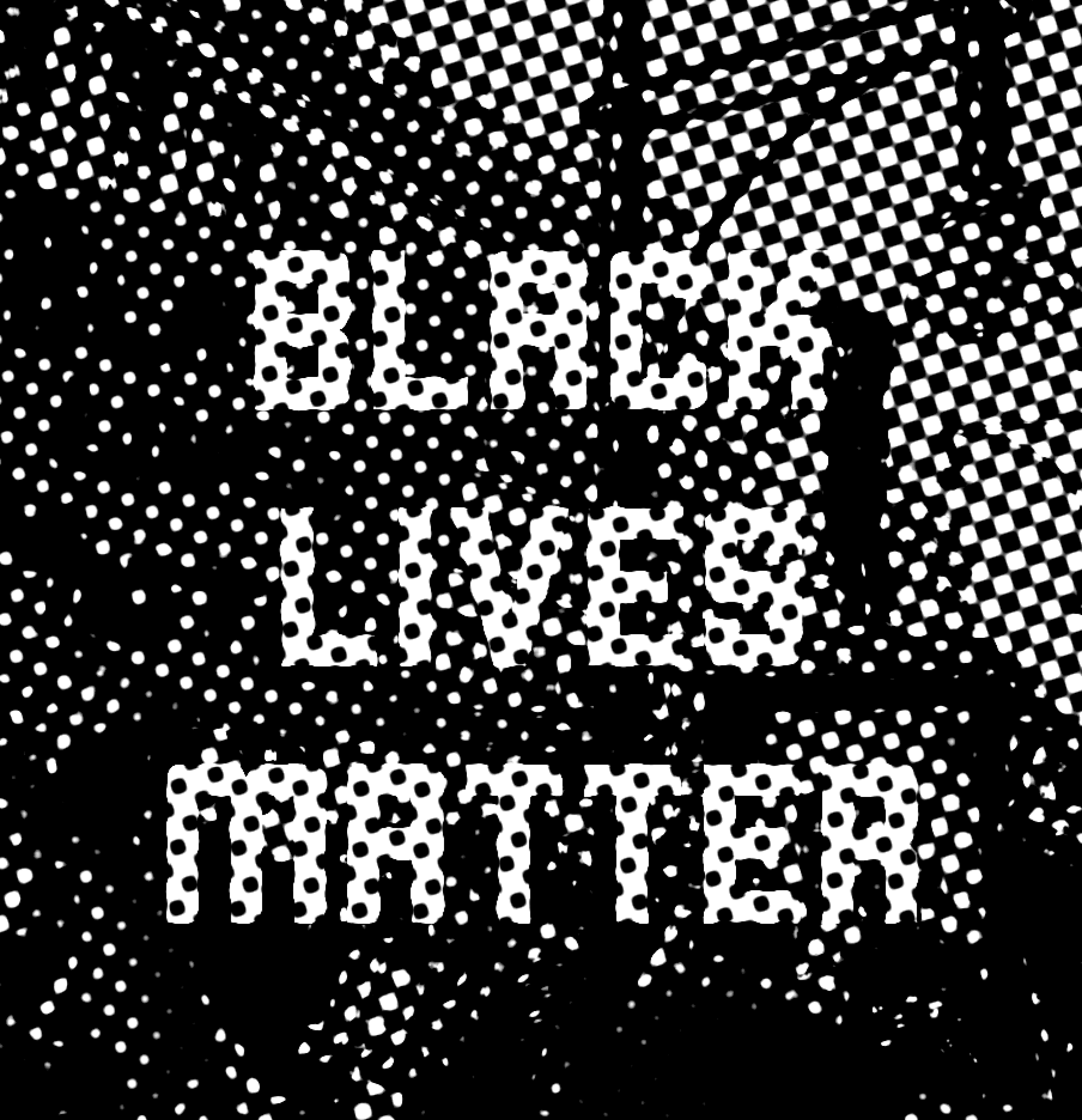
“Black Lives Matter” (United States, 2020)
On May 25, 2020, George Floyd was killed in Minnesota by a police officer who pinned his knee on Floyd’s neck for nearly nine minutes. This sparked global protests against systemic racism and police brutality. Signs reading “I Can’t Breathe” and “Black Lives Matter” became rallying cries overnight. Founded in 2013, Black Lives Matter already had a strong digital footprint, using bold graphics and hashtags to unite millions on platforms like Twitter and Instagram. In this moment, design proved essential for amplifying the movement’s message — turning outrage into a worldwide call for justice.
Bold Typography: The movement’s name—“Black Lives Matter”—appears in uppercase, sans-serif fonts that are easy to read and visually powerful.
High-Contrast Colours: Predominantly black-and-white schemes (sometimes with yellow accents) ensure striking visibility in both digital and physical spaces.
Hashtag Emphasis: “#BlackLivesMatter” transformed the phrase into a shareable rallying point on social media, making it instantly recognisable and easy to spread.
Decentralised Imagery: While there’s no single, official logo, grassroots designers created
a variety of icons (like fists and silhouettes) that all reinforced the same core message.
Global Mobilization: Eye-catching graphics and hashtags unified protesters across continents, fueling massive rallies and demonstrations.
Social Media Virality: Simple, consistent branding made it easy for users to adopt the message in profile pics, posts, and memes, accelerating awareness.
Shift in Public Discourse: The ubiquitous images and slogans pressured mainstream media and politicians to address systemic racism, leading to legislative debates and policy proposals.
Empowerment and Solidarity: The directness of the visuals fostered a sense of collective identity, encouraging people—especially younger generations—to engage in activism both online and off.
Key design features
Effect on social behaviour
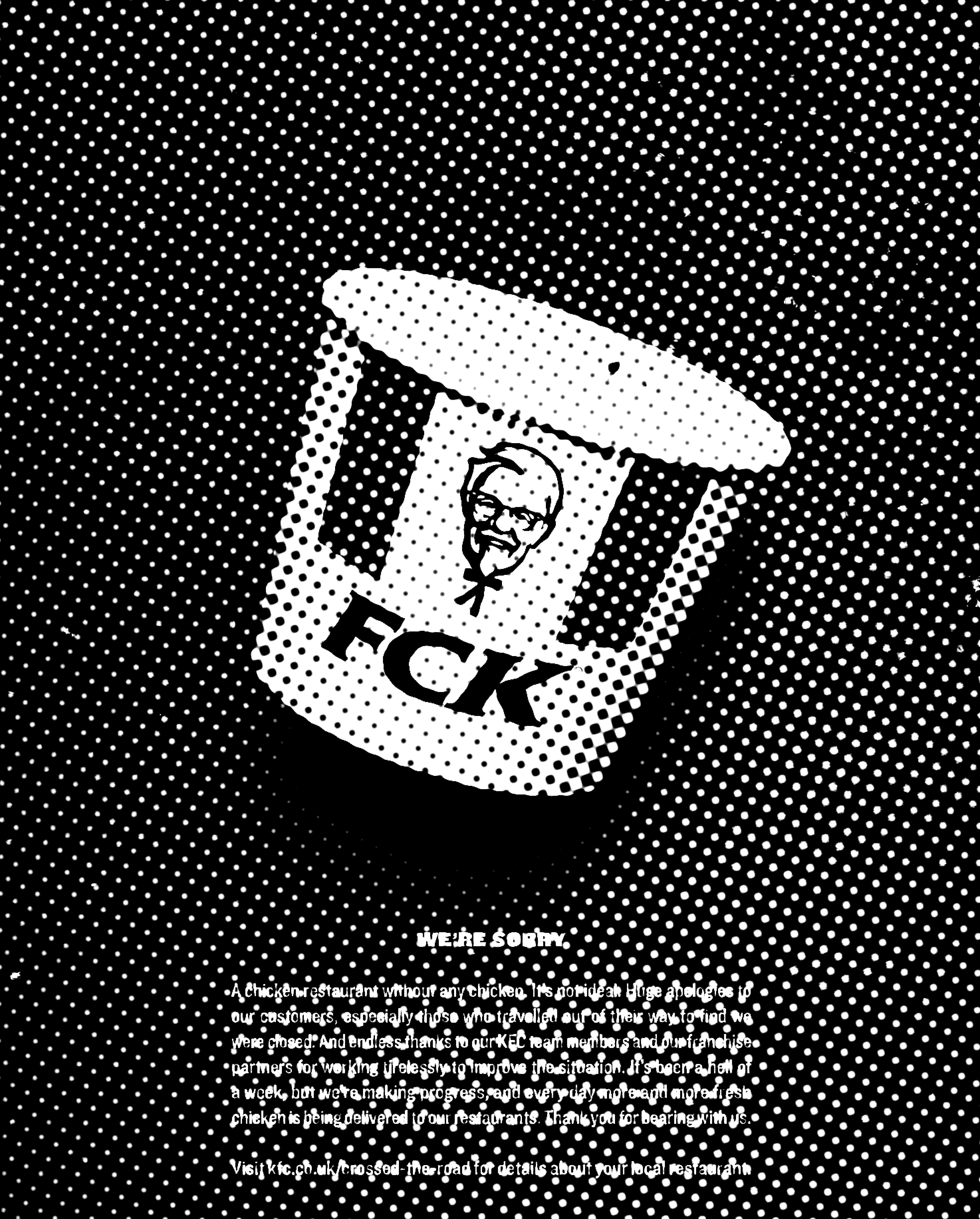
“FCK”
(United Kingdom, 2018 )
Sometimes the best way to handle a crisis is with a bit of humour. When KFC ran out of chicken—its core product—the brand issued an eye-catching apology ad that simply rearranged its initials to read “FCK.” This bold move turned a major supply-chain failure into a memorable moment, pairing playful wordplay with an honest “We’re sorry,” and ultimately winning over fans who appreciated the brand’s openness and wit.
Playful Letter Rearrangement: Swapping “KFC” for “FCK” instantly grabbed attention and signaled a lighthearted take on an embarrassing supply-chain mishap.
Minimalist Layout: The ad centred on a nearly empty KFC bucket and large, bold text, making the visual pun impossible to miss.
Bold Brand Colours: KFC’s trademark red and white remained prominent, reinforcing brand identity despite the cheeky twist.
Direct Apology Tone: Short, sincere copy accompanied the bold headline, striking
a balance between humour and genuine remorse.
Instant Viral Appeal: The cleverly executed wordplay spread quickly on social media, turning a PR crisis into a viral talking point.
Brand Goodwill: Many customers praised KFC for owning its mistake, which helped restore trust and loyalty.
Shared Humour: By embracing the fiasco with wit, KFC encouraged people to laugh off the inconvenience, lowering tensions around the shortage.
Corporate Transparency: The straightforward apology resonated with consumers craving honesty, exemplifying how humour can soften the blow of
a public relations misstep.
Key design features
Effect on social behaviour
Bibliography:
[1]
Barnicoat, J. (1972). A concise history of posters: 1870–1970. Thames and Hudson; p. 2–50 [10].
Black Lives Matter. (n.d.). About. Retrieved from https://blacklivesmatter.com/about
[2]
[3]
[4]
[6]
[5]
Shepard Fairey (2003). Obey Giant. Paris: La Base 01.
Ewen, S. (1996). PR : a Social History of Spin. New York: Basic Books.
Lee, S., Heller, S. and Perry-Zucker, A. (2009). Design for Obama : posters for change :
a grassroots anthology. Cologne, Germany: Taschen.
Fogg, B.J. (2003). Persuasive Technology : Using Computers to Change What We Think and Do. Amsterdam: Morgan Kaufmann, pp.20–45.
[7]
Gal, K. (2017). ‘FCK’ KFC Apology ad: How the Brand Turned a Crisis into an Iconic moment. [online] Campaign Live. Available at: https://www.campaignlive.co.uk.
Glaser, M. and Ilić, M. (2005). Design of Dissent. Rockport Publishers, pp.48–65.
[8]
[9]
[10]
[12]
[11]
Reed, T.V. (2019). The Art of Protest. U of Minnesota Press, pp.72–80.
Newman, B.I. (1999). The Mass Marketing of Politics: Democracy in an Age of Manufactured Images. Sage Publications, Inc, pp.34–38.
Heller, S. and Vienne, V. (2018). Citizen Designer : Perspectives on Design Responsibility (Second Edition). La Vergne: Allworth Press, pp.105–111.
Adweek (2017). That Cheeky KFC ‘FCK’ Ad in the U.K. Just Won a Big Creative award. [online] Adweek. Available at: https://www.adweek.com/.
[13]
Maqbool, A. (2020). How BLM Went from Facebook Post to Global Movement. BBC News. [online] 10 Jul. Available at: https://www.bbc.co.uk/news/world-us-canada-53273381.
[14]
Wong, H. (2020). Black Lives Matters: the role of graphic design in protest movements. [online] Design Week. Available at: https://www.designweek.co.uk/issues/1-7-june-2020/black-lives-matter-graphic-designs-role-in-the-protest-movement/.